Perhaps it was inspired by
Abby's fantabulous template tweaking on her own blog, or perhaps because my current template was never meant to be more than a stopgap after white font suddenly became a no-no in Blogger. Whatever the cause, I'm looking to change up my color scheme. I have a couple photos I really like:
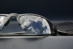
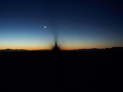

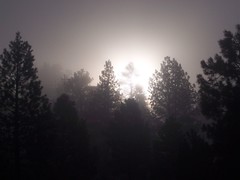
Thoughts? What makes for a good banner?


3 comments:
Those are all sweet pictures. I think 2 would be best for a blog, since it so cleary portrays a persona of some type. I really like 4, but it would be a better representation of something more...mystical.
But, they're all really cool pics and would serve you well, I think.
I agree with Kenny
These are fabulous, Dave. Some of favorites from you. I still use a couple of your photos on my blog.
Post a Comment